Without fail, the conversation about color in the kitchen reemerges every year. Colorful kitchens have been a trend in interior design throughout the decades, with periods of toned-down neutrals interrupting more vibrant kitchen design styles. Trends aside, how you choose to incorporate color into your kitchen is a deeply personal choice. Ultimately, the use of color in kitchen design is an opportunity for homeowners to express their individuality and showcase their unique style. While different factors like the size, layout, and overall goals of your kitchen are important to consider when thinking about a color scheme, it all comes down to what sparks joy for you in a space you’ll be using daily.
At first, the thought of incorporating more color into your kitchen might seem like a completely overwhelming task. However, there are many ways to incorporate color into your kitchen, whether it’s with more subtle touches, vibrant appliances, or a bold monochromatic color scheme. Are you ready to invite some color into your home? Read on to discover these 8 helpful tips for infusing more color into your kitchen.
1. Experiment Before You Commit


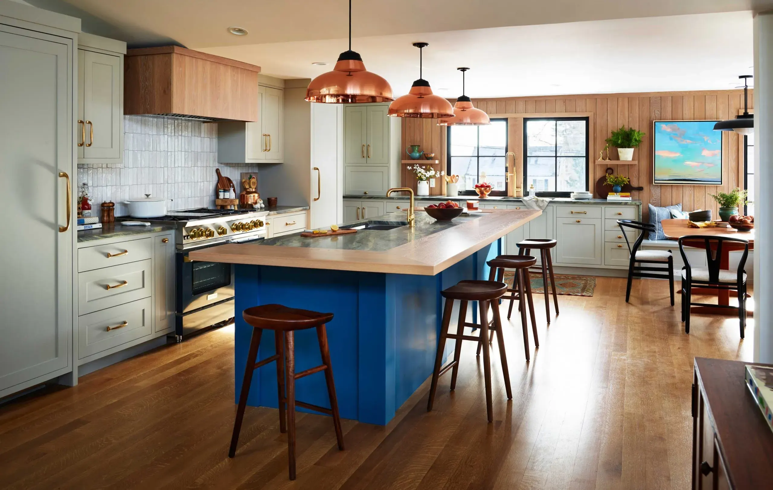
Designing a kitchen can be an intimidating task, but experimenting in small ways before committing to big changes is a way to mitigate any regrets later down the line. If you’re starting with a blank slate, like a neutral toned kitchen, then you might be feeling called to add in a splash of color. Before painting all your cabinets your favorite shade of blue, we recommend starting off with that color as an accent color. Choose a part of your kitchen to weave it into, like the trim, upholstery, an accent wall, artwork, or dishware. For any painted surface, make sure to study the color as the light shifts throughout the day to make sure the color and tone is what you’re really looking for. Once you’ve lived with this new pop of color for a while, you might decide you’re ready to apply it in a larger context in your space. This way, you can easily avoid the pang of color regret by starting off slowly.
2. Get Colorful With Your Appliances

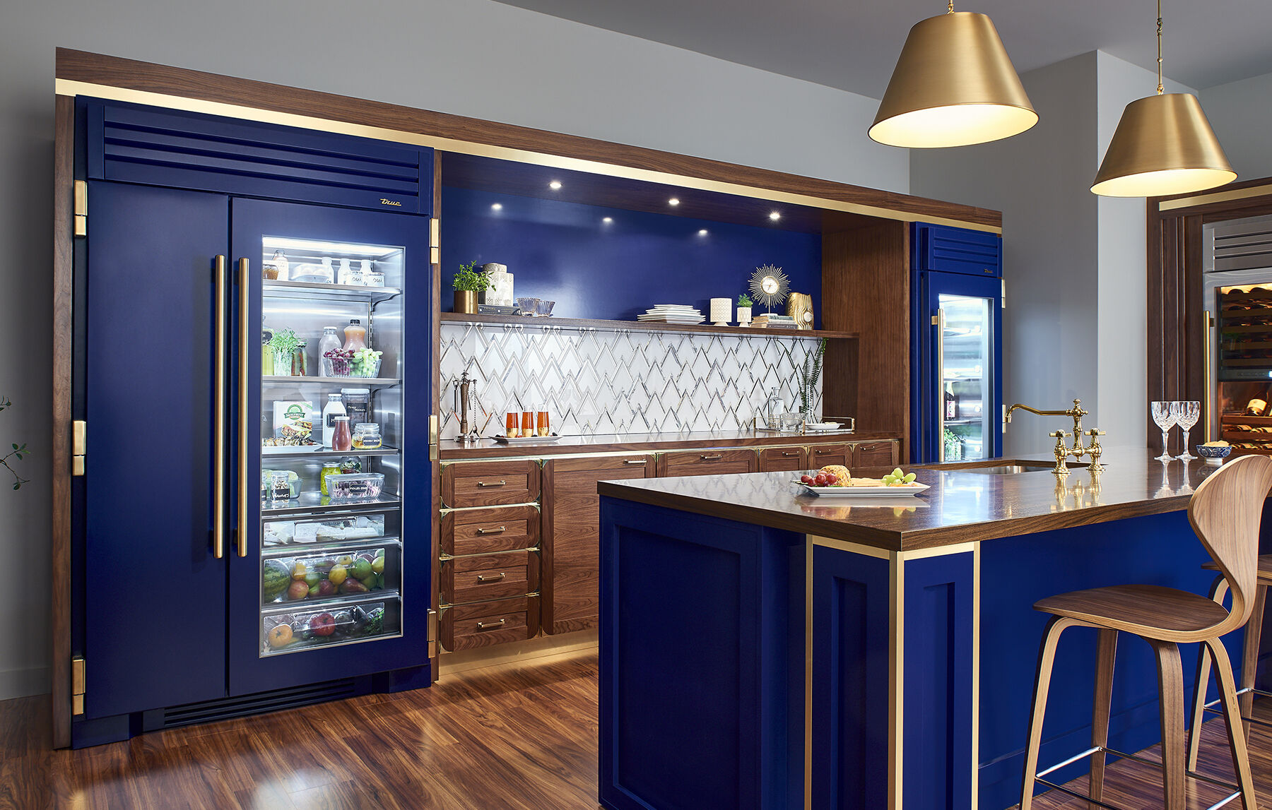
One of the simplest ways to introduce color into your kitchen is through the use of colorful appliances. Instead of sticking to the conventional stainless steel or neutral-colored options, consider making your appliances the star with bold and vibrant shades. “A colorful range or refrigerator can instantly become a statement piece in your kitchen, adding a burst of personality and style,” comments Shae Wilder of BlueStar. BlueStar appliances are not only award-winning in terms of performance, but they’re also the only pro-style appliance brand to offer virtually unlimited options for personalization, including 1,000+ colors and trims. From cheerful yellows and refreshing blues to earthy greens and bold reds, there is a wide spectrum of color options available to cater to every taste.
For a kitchen that packs an extra punch, “custom color match your kitchen appliances to seamlessly blend with your painted cabinetry,” says Shae Wilder. This creates a unique monochromatic look and for those who can’t get enough of their favorite color, is a fabulous choice.
3. Don’t Choose Colors Based on Trends


If you’re plugged into the interior design world, you’ve most definitely heard all the chatter regarding the top trending kitchen colors. In past years, predominantly all-white or grey kitchens were popular, whereas most recently earthy shades of green have been touted as the most popular kitchen color. The truth is, kitchen color trends are constantly evolving, and the best way to determine what shades are right for your kitchen is to treat it as a way of self-expression, just like shopping for clothing or jewelry.
One common mistake when trying to incorporate color into your kitchen is defaulting to trends. Alicia Giampaolo, the Senior Store Design Manager at PIRCH, believes there are few design mistakes one can make. However, “one mistake is choosing a color or style solely because it’s on trend,” Alicia says. “Does it fit with your personality or your lifestyle? Is this something that you can see still in your kitchen 7 years down the line and still love as much as you did the day the color was first applied?” Alicia adds. These are all important factors to consider when choosing a primary color for your kitchen.
The same logic applies for outdoor kitchens. Cedric Wells, Creative Director of VLAZE UK, “recommends choosing a color that resonates with you and your surroundings rather than being influenced too much by trends.” To start, he suggests gathering up samples and visuals of finishes you like to help envision that final look. “It is also worth remembering that outside light is more forgiving than indoor light. It changes dramatically throughout the day and into the evening so even the boldest of color choices can adapt to your space,” says Cedric.
4. Don’t Forget Your Outdoor Kitchen!

If you’re a color enthusiast, it would be a crime to leave all the color to the inside of your home. To refresh your outdoor kitchen or entertaining space, “begin by choosing a dominant color that complements your outdoor surroundings, then add pops of contrasting hues for visual interest,” says Cedric Wells, Creative Director of VLAZE. Dominant colors can be applied to surfaces, decorative tiling, walls, or cabinetry. To add visual interest and complement your main color choice, explore foliage and flowers, light fixtures, and textiles such as outdoor rugs, cushions, and table linens.
When embarking on an outdoor kitchen design, it’s also important to “consider the durability of outdoor finishes to ensure longevity,” explains Cedric. “At VLAZE, we use glossy porcelain enamel which doesn’t fade or discolor even in the most extreme climates.” VLAZE’s vibrant outdoor cabinetry is crafted from 304 grade stainless steel and wrapped in durable porcelain enamel, making their surfaces weatherproof and able to maintain their brilliance despite frequent exposure to sunlight, rain, coastal wash and cooking activities.
For additional colorful options, Moya Living’s powder-coated steel custom cabinetry is designed and manufactured right here in Southern California. Their kitchen cabinets feature clean aesthetics, bold colors, and chic designs. Plus with Moya Living, you can dream up any shade you’d like, because their cabinets can be designed to any color order.
5. Swap Out Your Hardware for a Fresh Touch!

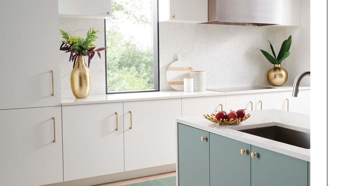
Using hardware to experiment with color is a low stakes way to explore new hues. Compared to cabinetry or flooring, hardware is easily interchangeable and relatively low-cost. By incorporating colored hardware such as cabinet knobs, drawer pulls, and light fixtures, homeowners can make a bold design statement and infuse their kitchen designs with a pop of color. Hardware brands like VESTA, Sherle Wagner International, and Top Knobs offer premium hardware styles with colorful options such as natural stones and colored crystals. Whether opting for vibrant hues like red, blue, or yellow for a playful and energetic look, or choosing more subdued shades like matte black or brushed gold for a sophisticated and modern feel, colored hardware can instantly elevate the overall aesthetic of the kitchen. Even small touches on appliances can make a big difference in an otherwise neutral kitchen because “for some, full colored appliances are too much,” comments Shae Wilder of BlueStar. “Consider just a pop of color with colored knobs or trim finishes to make your appliances unique.”
6. Add in Open Shelving

Open shelving is a creative way to incorporate color into your kitchen without having to make too many dramatic changes. It offers both functionality and aesthetic appeal and can be a fun project for anyone who is interested in interior design and decorating. Plus, it’s an amazing way to infuse your personality into your kitchen by putting your favorite collectibles on display. To make the most out of your open shelving, try displaying a mix of dishware, glasses, houseplants, vases, and décor items. With proper styling, open shelving can be a practical and stylish addition to your kitchen and add splashes of color in a subtle way.
7. Experiment With Tile
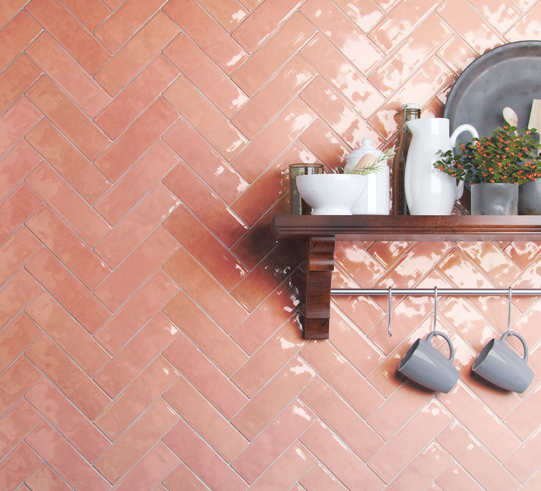

Tile is an incredibly versatile surface for the home, adding interest and functionality to floors, backsplashes, showers, fireplaces, and more. Not only is tile applicable in many applications, but it is the perfect canvas for color. If you need some color inspiration, rich tones such as terracotta, deep blues, and lush greens are ideal for creating a relaxed atmosphere reminiscent of nature, while colors like bright yellow or orange can be energizing and inspire positivity.
Colorful tiles can also be utilized as a part of color drenching in a room or space. Color drenching is an interior design technique that involves saturating a room with a color or range of shades in the same color family. It can work wonderfully in kitchens, creating a harmonious backdrop for appliances. For instance, the walls, cabinetry, and tile backsplash in a kitchen could all match in a beautiful shade of yellow, blue, or pink, creating a cohesive and visually striking environment. With this method, smaller spaces can appear larger if using light colors, or dark and dramatic with the use of a darker color.
Patterned tile is another great choice for incorporating color into a kitchen. From intricate geometric patterns to bold floral motifs, patterned tiles add visual interest and lots of personality to a space.
We especially love the use of pattern in Joseph Rodrigues’s Napa-inspired kitchen, where the green and brown tiles complement this transitional farmhouse kitchen. The use of pattern and color only serves to infuse your home with personality and character, making it undeniably yours!
8. Use the 60-30-10 Rule!
Did we save the most important tip for last? Maybe! If you’ve never heard of the 60-30-10 rule, it is a widely recognized principle in interior design that provides a framework for creating a cohesive color scheme. This classic design rule is simple but could be very helpful if you’re feeling overwhelmed with a kitchen design project.
According to this rule, 60% is the main color of the room, including cabinetry and tile in a kitchen environment. If you squinted your eyes when you walked into the room, the 60% color would be the predominant color you would see. 30% refers to the secondary color in your space, which will support the main color. This color includes accent chairs, furniture, an accent wall, or similar features and its main purpose is to provide contrast to the main color. The final 10% is your accent color, which can be as bold or as subtle as you want. This 10% can be what gives the room character or keeps it on the neutral side, but it is entirely up to personal preference. For the accent color, think of incorporating it into artwork, pillows, candles, hardware, or florals. When trying to implement the 60-30-10 rule in your kitchen design plan, “it’s also important to consider how colors work and blend with the rest of the existing space and your home. This is especially important if you’re only updating a few finishes here and there,” explains Alicia Giampaolo, Senior Store Design Manager at PIRCH. Ultimately, “colors can look very different in application versus the aisle in the store,” Alicia adds.
Color plays a crucial role in kitchen design, influencing the overall atmosphere and feeling of your home. While warm hues like reds, oranges, and yellows tend to invigorate and energize, cooler colors like blues, greens, and purples evoke feelings of calmness and serenity. Beyond these guidelines, there are countless ways color can be implemented into your kitchen to match your unique design aesthetic. While adding color into any design can feel like a daunting task, we hope this blog post gave you some useful tips and tricks to start the process. Whether you’re looking to incorporate a bold and bright kitchen design or opting for a more subtle route with colored accents, all that matters is that your kitchen reflects your personality and can stand the test of time. Embrace the transformative power of color, and who knows, maybe you’ll even learn to love coloring outside the lines!
Are you looking to refresh your kitchen in 2024? We can help! Click here to make an appointment at your nearest PIRCH showroom.


Click to view full image.